How to Choose the Best Paint Colors for Your New Home
When building a custom home with Inspire Homes, one of the most transformative design choices we make is selecting the ideal paint colors. The right palette doesn’t just decorate a space—it defines its atmosphere, whether you’re aiming for bright and airy, warm and inviting, or bold and dramatic.
A fresh coat of paint can completely revitalize a room, infusing it with personality and character that reflects your family’s unique style. Thoughtful color choices can highlight architectural features, create a sense of balance, and influence the mood of your home. With the right hues, you can energize, calm, or inspire—crafting a space that perfectly suits your lifestyle.
We know choosing the perfect colors can feel daunting. With thousands of options, each carrying subtle undertones and varying finishes, the decision can quickly become overwhelming. That’s why at Inspire Homes, we’ve curated a guide with our top tips and strategies to make the process seamless. Together, we’ll help you select a color scheme that enhances your custom home and stands the test of time.
Add Pops of Color Strategically
In our modern custom homes, we often use neutral or white-toned interiors as a base, and for good reason—too much color can make spaces feel cluttered, especially once we add furniture and décor. But that doesn’t mean we have to avoid color entirely.
We can introduce vibrant hues in smaller spaces where they’ll have the most impact. A home office, for example, is the perfect place for us to experiment with bold colors that spark creativity and focus. Hallways and transitional areas, often overlooked, can become delightful passages with just a touch of color. Feature walls are another great way for us to incorporate striking hues without overwhelming a space, serving as backdrops for artwork, furniture, or architectural details like a fireplace or built-in shelving.
This approach allows us to enjoy dynamic pops of color while maintaining a cohesive, uncluttered feel throughout our home.

Understand Paint Undertones
Choosing a paint color involves more than just picking a shade of blue, green, or gray. Every color has undertones—subtle hints of other hues that influence how it looks in different lighting conditions and next to other materials.
For example, a gray paint might have blue, green, or purple undertones that become more apparent once it’s on our walls. These undertones will either complement or clash with our flooring, cabinetry, and furniture. Reflections from materials like wood or stone can also alter how a color appears.
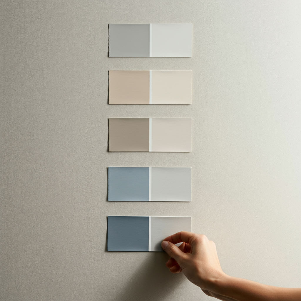
To avoid surprises, we should always test paint colors. We shouldn’t rely only on small swatches. Instead, we need to apply a test patch directly on our wall and observe it over several days to see how it interacts with our home’s lighting and surrounding materials.
Evaluate Colors in Different Lighting
Lighting dramatically affects how paint colors look throughout the day. A shade that appears perfect under bright showroom lights might look completely different in our home’s unique lighting environment.
Natural light changes based on the direction of our windows. South-facing rooms get soft, diffused light that can make dark colors appear richer and light shades feel muted. North-facing rooms, on the other hand, receive bright, direct light that can intensify dark colors but wash out lighter tones.
Artificial lighting also alters color perception. Warm LED bulbs enhance reds, yellows, and oranges while muting cooler shades like blues and greens. By using floor lamps, table lamps, and accent lighting, we can help balance our room’s illumination. Installing dimmer switches lets us adjust light levels and fine-tune how our colors appear at different times of day.
Stay Current with Paint Trends
While our personal taste should guide our decisions, keeping up with current trends can help our home feel fresh and modern. Neutral palettes remain popular, and serene whites, beiges, and greiges offer timeless appeal. Shades like Sherwin-Williams’ Pure White, Alabaster, and Accessible Beige, or Farrow & Ball’s Strong White and Pointing, give us elegant, versatile options.
Greige tones—a mix of gray and beige—are especially popular, bringing both warmth and modernity to our spaces while providing a sophisticated backdrop for colorful furniture and artwork. But we don’t have to shy away from bold colors. Many of us are adding bright accent walls and vibrant pops in creative spaces like offices or entertainment rooms to inject energy and personality into our homes.
Warm vs. Cool Colors: Create the Right Atmosphere
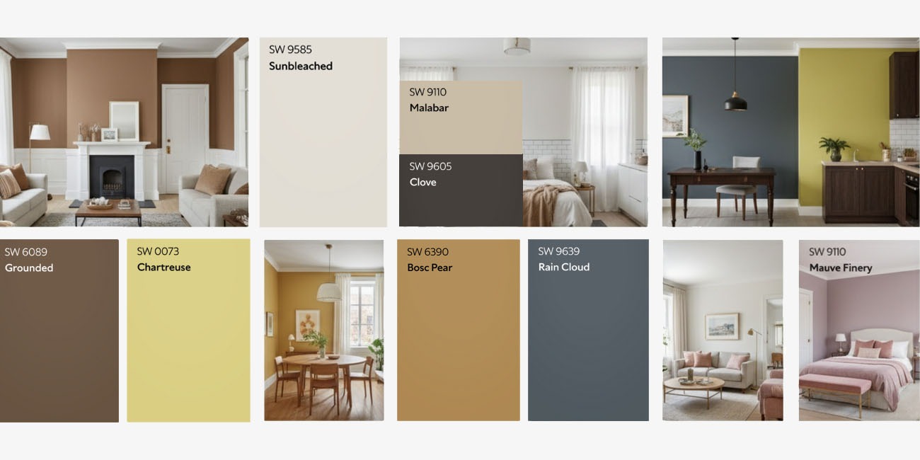
Understanding how warm and cool colors affect mood can help us design spaces that feel just right. Warm colors like red, orange, and yellow create energy, intimacy, and sociability. They’re ideal in gathering spaces such as kitchens and living rooms, where we want to encourage activity and conversation. Warm tones also have a visual effect of “advancing,” making large rooms feel cozier.
Cool colors, like blue, green, and light purple, promote calm and relaxation, making them perfect for our bedrooms, bathrooms, or spaces meant for unwinding. These shades visually “recede,” helping smaller rooms feel more open and spacious.
The key is balance. Even in a predominantly warm or cool room, adding accents on the opposite end of the spectrum—through our furniture, artwork, or accessories—creates harmony and visual interest.
Test Colors Thoroughly
The best way to ensure our chosen colors look perfect is to test them in our actual space. Small swatches are helpful but can’t give us a full picture. Instead, we should paint large test patches on our walls or use pieces of cardboard to move around the room.
We’ll want to observe how the colors look during different times of day and under various lighting conditions. We should consider seasonal changes, daily activities, and how the shades interact with our furnishings and décor. Taking time to test colors prevents costly mistakes and ensures we’ll love the final result.

Invest in Premium Paint
High-quality paint doesn’t just look better—it lasts longer. Personally, I always reach for premium brands like Sherwin-Williams and Farrow & Ball for their excellent coverage, durability, and rich color depth., we recommend premium brands like Sherwin-Williams and Farrow & Ball for their excellent coverage, durability, and rich color depth.
Sherwin-Williams paints resist fading, scuffing, and wear, maintaining their fresh appearance for years. Farrow & Ball’s luxurious formulations use high concentrations of pigment, creating beautiful, complex shades that shift subtly with the light. Both brands offer washable finishes, making maintenance easy while preserving our investment.
Ready to Get Started?
Personally, I always reach for premium brands like Sherwin-Williams and Farrow & Ball for their excellent coverage, durability, and rich color depth., choosing your paint colors is more than just picking swatches—it’s about crafting the perfect atmosphere for every space. Here are a few simple tips to help guide you as you move through the process:
- When you’re testing colors, sample your favorites on several walls and check them in morning, afternoon, and evening light. You’ll be surprised how much the look changes, and it’s all about finding what feels right during your daily routine.
- As you explore color options, pay extra attention to undertones—even “simple” shades like white or gray can have sneaky blue, green, or yellow notes. Always compare your paint swatches with things like your flooring, cabinets, and countertops to make sure the whole room works together.
- If you’re torn between going bold or playing it safe, remember: start with neutrals and add pops of color in small doses. Neutral bases (like whites, greiges, or taupes) offer a timeless look, while accent walls and decor let you bring in your personality without overwhelming the space.
- Think about finish as well. Matte hides imperfections, eggshell and satin are easy to clean (perfect for busy areas), and semi-gloss adds subtle shine to trim and doors.
- Another trick—balance warm and cool tones. Warm shades create a cozy vibe but can make rooms feel snug, while too much cool can seem stark. Mix them together for harmony: try a cool wall with warm accents, or vice versa.
- Live with your samples before committing. Leave those test patches up for a few days, and pay attention to which colors make you feel happiest every time you walk in.
And as always, the Inspire Homes team is here with expert advice and personal support to help you decide what works best for your home and your family.
 Frequently Asked Questions
How do I choose the right paint color if I’m feeling overwhelmed?
You’re definitely not alone! The options can feel endless. Focus first on the vibe you want for the room—relaxed, energizing, cozy, minimal? Start simple with a neutral base, then layer in color through samples. Always test a few on your own walls and look at them in different lighting throughout the day. The right color is the one that makes you smile every time you come in.
Should I test paint samples before making a final decision?
Absolutely! Never skip the sample pots. Colors can look completely different once they’re on your wall versus a tiny chip in the store. Pro tip: paint a few generous swatches in different spots and give them a few days—you’ll quickly spot your favorite.
What should I consider when picking paint finishes?
Think about the job that space needs to do. Flat and matte finishes are great for hiding imperfections, while eggshell and satin stand up to busy hallways and kids’ rooms. For doors and trim, try semi-gloss for durability and a gentle shine.
Can I mix warm and cool paint colors in the same home?
Definitely—mixing is one of the best ways to make a house feel lively and balanced! For example, you might pair a cool blue wall with warm wood shelves or add brass fixtures for a cozy accent in a mostly cool-toned room. Don’t be afraid to experiment.
Is high-quality paint really worth it?
In my experience, 100% yes. Premium paints (like Sherwin-Williams or Farrow & Ball) give richer colors, better coverage, and stand up to family life—fewer scuffs, easy cleaning, longer-lasting good looks. It’s worth a little extra upfront for something you’ll enjoy every day.
Still have questions?
I love chatting about color and home ideas! If you’re stuck or just want a second opinion, send your questions my way—happy to brainstorm or offer a few friendly tips.
Personally, I always reach for premium brands like Sherwin-Williams and Farrow & Ball for their excellent coverage, durability, and rich color depth.


